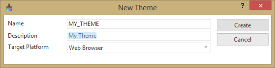
1. Select New / Theme from the File menu and enter Name and Description. Target Platform should be Web Browser.
Target Platform options are: All Platforms, Web Browser or Windows.
2. Scroll down the Colors tab to define the Primary color.
a. Select a color by clicking a color option from the color block provided:
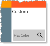
b. Alternatively, enter a Hex Color value (e.g. #42bcf4) in the Custom option, at the bottom right corner of the colors block:
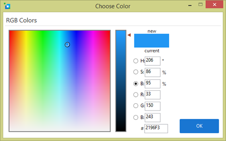
c. Or click the Search icon  to open a color picker:
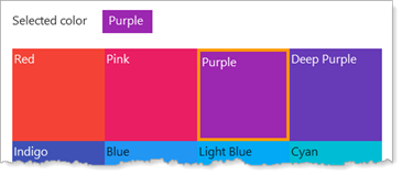
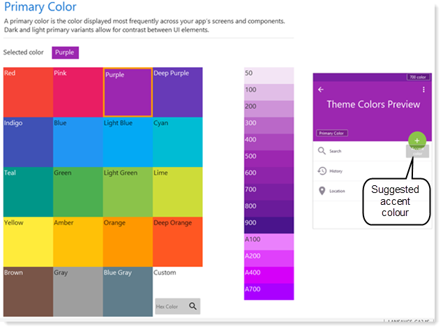
The following image shows the color Purple selected as the Primary color. Note the range of variant colors (to the right of the color panel) which are generated. (These are based on Google Material Design Color standards.) The preview image on the right illustrates how colors might be used in your web page design.
An accent color will be set automatically, based on your primary color, with light, medium and dark shades. You can select an alternative accent color if required.
Accent colors should be applied sparingly to accentuate specific parts of your UI. For example, to highlight certain buttons or a particular selected tab sheet.
This image shows green Accent colors, generated for the Primary color Purple:
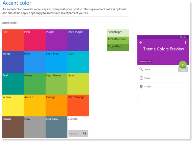
Note: In use, accent colors are named as LightAccent, MediumAccent and DarkAccent.
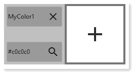
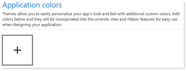
The last section on the Colors tab may be used to define application colors. These are optional and should be used to define any additional colors, for example as part of your corporate standards:
Keep in mind that the Primary color and Accent color have defined a total of 26 color shades available within the theme.
When the Application colors Add icon (+) is clicked, one or more application colors may be defined by entering a Hex color or using the color picker: